Symmetry vs Asymmetry: Which Style Is Best for Your Design?
The principles of visual harmony, often explored by design institutions like the Bauhaus, significantly influence our perception of balance. Within this realm, the debate of symmetry vs asymmetry emerges as a core consideration. Graphic design software, such as Adobe Illustrator, provides the tools to experiment with these contrasting approaches. Understanding how gestalt psychology plays into both symmetrical and asymmetrical arrangements is crucial for achieving effective and visually appealing compositions. The choice between symmetry vs asymmetry fundamentally shapes the overall aesthetic of any design.
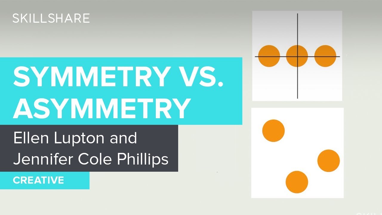
Image taken from the YouTube channel Skillshare , from the video titled Symmetry vs. Asymmetry in Graphic Design .
Symmetry vs Asymmetry: Achieving Visual Harmony in Design
Choosing between symmetry and asymmetry in design is a crucial decision that dramatically impacts the overall aesthetic and message conveyed. Both approaches have their strengths and weaknesses, and the "best" choice ultimately depends on the specific project goals and desired effect. This guide explores the nuances of each style, helping you determine which is best suited for your design needs.
Understanding Symmetry
Symmetry, at its core, is about balance achieved through mirrored or evenly distributed elements. It relies on the predictability and inherent harmony that comes from repeating forms.
Types of Symmetry
Symmetry isn’t a monolithic concept. Different types of symmetry can be employed to create varying visual effects:
- Bilateral Symmetry (Reflection): The most common type, where one half of the design mirrors the other across a central axis. Think of a butterfly or the human face.
- Radial Symmetry: Elements radiate outwards from a central point, like a starfish or a snowflake.
- Rotational Symmetry: Elements are arranged around a central point and repeated through rotation. Imagine a pinwheel or a four-leaf clover.
- Translational Symmetry (Repetition): Elements are repeated in a linear fashion, creating a pattern. Think of stripes or a tiled floor.
Advantages of Symmetry
- Creates a Sense of Order and Stability: Symmetrical designs inherently feel stable and grounded.
- Conveys Trustworthiness and Professionalism: The predictability of symmetry can inspire confidence and a sense of authority.
- Easy on the Eye: Our brains are naturally drawn to symmetry, making it visually pleasing and comfortable.
- Simplicity and Clarity: Symmetry often allows for straightforward and easy-to-understand layouts.
Disadvantages of Symmetry
- Can Be Predictable and Boring: Overuse of symmetry can result in a lack of visual interest.
- May Lack Dynamism: The static nature of symmetry can sometimes feel too rigid and unmoving.
- Limited Creative Expression: Strict adherence to symmetrical principles can stifle creativity and originality.
Exploring Asymmetry
Asymmetry, in contrast to symmetry, is about balance achieved through unequal distribution of elements. It relies on visual tension and the interplay of contrasting forms to create interest.
Achieving Balance in Asymmetry
While asymmetrical designs are not mirrored, they still require balance to be visually appealing. This balance is achieved through:
- Visual Weight: Larger or bolder elements have more visual weight than smaller or lighter ones.
- Color and Contrast: Bright colors and high contrast attract attention and add weight.
- Positioning: Objects placed further from the center have more visual weight.
- Negative Space: Strategic use of empty space can balance heavier elements.
Advantages of Asymmetry
- Creates Visual Interest and Dynamism: The unexpected nature of asymmetry captures attention and keeps the eye moving.
- Conveys Energy and Creativity: Asymmetrical designs often feel more modern, innovative, and playful.
- Allows for More Creative Expression: Asymmetry provides more freedom to experiment with different layouts and compositions.
- Highlights Specific Elements: Asymmetry can be used to draw attention to a particular focal point.
Disadvantages of Asymmetry
- Can Be Difficult to Execute Well: Achieving balance in asymmetry requires careful planning and attention to detail.
- May Appear Chaotic or Unstable if Done Poorly: A poorly balanced asymmetrical design can feel jarring and uncomfortable.
- Requires More Design Skill: Mastering asymmetry requires a deeper understanding of visual principles.
- Potential for Distraction: The dynamic nature of asymmetry can sometimes distract from the core message.
Comparing Symmetry vs Asymmetry: A Quick Reference
| Feature | Symmetry | Asymmetry |
|---|---|---|
| Balance | Achieved through mirrored elements | Achieved through unequal distribution |
| Feeling | Orderly, stable, formal | Dynamic, energetic, creative |
| Complexity | Generally simpler to execute | More complex, requires careful planning |
| Visual Impact | Can be predictable, sometimes boring | Can be visually striking and engaging |
| Best For | Formal settings, conveying trustworthiness | Modern designs, highlighting key elements |
Choosing the Right Approach: Questions to Consider
Before deciding between symmetry vs asymmetry, consider the following questions:
- What is the message you want to convey? Do you want to project stability and reliability, or creativity and innovation?
- Who is your target audience? Consider their preferences and expectations.
- What is the context of the design? Is it for a website, a brochure, or something else?
- What is the purpose of the design? Is it to inform, persuade, or entertain?
- What are the brand guidelines? Are there any existing design elements that need to be considered?
By carefully considering these questions, you can make an informed decision about whether symmetry or asymmetry is the best choice for your design project. Remember that the best designs often incorporate elements of both symmetry and asymmetry to achieve a harmonious and engaging visual experience.
FAQs: Symmetry vs Asymmetry in Design
Here are some frequently asked questions about using symmetry and asymmetry in design, to help you choose the best approach for your project.
What’s the biggest difference between symmetrical and asymmetrical design?
Symmetrical design involves mirroring elements on either side of a central axis, creating balance and formality. Asymmetrical design, on the other hand, achieves balance through different elements of varying visual weight, resulting in a more dynamic and informal feel.
When is symmetry generally a better choice than asymmetry?
Symmetry often works best when you want to convey stability, elegance, or trustworthiness. Think of logos for banks or government institutions; symmetry reinforces a sense of order and reliability. Classic, timeless designs frequently utilize symmetry for its inherent balance.
Can you combine symmetry and asymmetry in one design?
Yes, absolutely! Combining symmetry and asymmetry can create visually interesting and engaging designs. You might use a symmetrical layout for the overall structure, but incorporate asymmetrical details to draw attention to specific elements. This approach offers the best of both worlds: a sense of order with a touch of dynamism.
Is one approach, symmetry vs asymmetry, objectively "better" for design?
No, neither symmetry nor asymmetry is inherently "better." The best choice depends entirely on the specific goals and message of your design. Consider your target audience, the overall brand identity, and the desired emotional response when deciding whether symmetry or asymmetry is more appropriate.
So, experiment with symmetry vs asymmetry, see what resonates with you, and let your creativity flow! Hope this gave you some food for thought!
